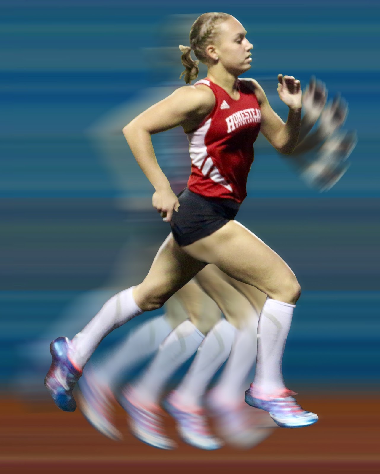
Monday, December 14, 2015


BEFORE...


AFTER!!!

FINAL PRODUCT!

Here is the end result after all of my tweaking and testing.

 I have added some techniques by using the "burn tool"
to help soften the edges of Grace overlying the blue streaked
backdrop.  This allowed me to smooth 
everything out and diminished the "superimposed" look.  
I also added an accent spotlight through the filter option, to give 
a pop of light around her middle torso.  
Lastly, I merged all of the layers together
and flattened out her image to give it a concrete feel.

The overall look that I've created is exactly what I had desired!
Now that I know what I am doing, this proof of concept will
allow me to continue working on the other 2 photos of Ava & Will, 
of which I had originally hoped to do also.
However, by singling this project down to ONE amazing
photo, it has allowed me to experiment more with the different
tools in PhotoShop.  The end result actually turned out 
much more precise and detailed than what I had hoped for.

Choosing the right backdrop:


Here is the final background image that I've chosen to
incorporate into my photo.  I really like the subtlety of knowing that
she's running on the grounded track with the blue in the background 
as a strong, bold blur.  

FINAL PRODUCT OF GRACE IN MOTION...


So here it is... My final creation of Grace blurred into her running format
while still remaining true to the original photo by keeping it as the main 
layer on the top.  All of the other layers are softened by lowering the opacity 
and by using the radial blur technique.  I've also added a second "ghost-like" image
of herself running slightly behind her.  The final radial movement of her left arm
has been added to this image and is also an important extension to this photo.
YAYYYY!  I am beyond THRILLED with what I've created.
Now, onto to choosing my final track backdrop to keep her from
floating in white space.     ;)


Background update for my final exam project:


The photo above consists of a track athlete from UW Madison.  This
is one of the track backgrounds that I am considering using
on my final photo.


**Here is another backdrop that is blurred and I am especially drawn to.
I think that this might add to my composition nicely, with Grace remaining
as the main emphasis for the final look.  


Lastly, here is one more option using a nighttime or darker backdrop.
It might look ok with the contrast difference but I'm not 100%
sold on this yet.  I'll have to play around to see which one I prefer.


Sunday, December 13, 2015

Here is the final addition of Grace's left arm with a lowered
opacity level and with a blurred effect.  Now I just need to attach this
to her final photo with the blurred right leg and then add a background.
Almost there...

Wednesday, December 9, 2015

Progress made today...


Today, I was able to focus on creating a pattern of arm series 
that will eventually coordinate with Grace's stride and the movement 
of her right leg.  Once again, I proportioned her shoulder socket
in the center and based her swing rotation off of that.
In the upper left, you can see the original arm that was cut away from her
 torso - using the polygonal lasso tool.  The middle arm was warped and stretched
 to elongate her swing in the radial direction from her shoulder within the
 boundaries of the red circle.  Finally, the far right hand is separated to allow me to 
conform her motility.  One more arm sequence to add.  So far, so good..   : )

Tuesday, December 8, 2015

Another update on my project...


Here is a look at how I was able to centrally use the axis from Grace's right 
hip and extend her leg in a true sense of her running form.
I started by centering her body in a divided circle to establish the movement
of leg rotations based off of her right hip bone.   
 Then, I lowered the opacity levels in each separate step of her leg around 10%
to portray the fading of each position.   Finally,
I added a subtle blur effect to create the sense of actually being in movement.  


After deleting my practice centering circle, I am now left with the finished
product of Grace's legs running.  I've reached my desired effect by having the 
top/original photo highlighted on the top and fading away with each step.
Next up...  her left arm.


Saturday, December 5, 2015

2nd Post Today of my Progress...


Here is my 2nd post of the progress that I am making today - I'm 
on a roll!  I've added a background layer of the "Running 
Cycle" to give me some perspective on the different movements
that I am looking to create.  I've also eliminated the arms
and am specifically focusing on the right leg and lowering the 
opacity on each individual step -  starting strongest at the original point
of interest, and then phasing into a lighter (ghost-like) series of steps.

Progress Update...


Here is an updated version of my work in progress.  I am attempting to "fine tune"
Grace's limbs and add some detail.  The original photo is highlighted in full definition
and the extra phases in her movement I am blurring and am lowering the opacity.
(The extra arm pieces off to the left are segments that I am working on - not
 actual parts that are meant to be floating in my final photo.)      : )
The two examples above are examples of what I am basing my project off of: 
"Run Cycle" which I found off of Google images and the
 "Nude Descending A Staircase" by Duchamp.   


Tuesday, December 1, 2015

Revision #2 - Final Project


I am changing the scope of my my project to base it off of ONE strong
image.  I'd like that final photo to depict a series of motions by using
sequential superimposed images of Grace in her running form. 
 So, essentially, it
will contain at least four other motions into different layers
on top of the original photo.  I am doing this as my proof of concept for future use
with my twins running photos and for other projects.   
This concept will hopefully remind you of 'The Matrix' movie
in which everything slows down, enabling the viewer to see the 
different layers of motion.  Also, as another reference, "Nude Descending
a Staircase" by Marcel Duchamp in 1912 created this type of style in
a modernist format that also included parts of cubism and futurism.